Our logotype
Here you can see how our logo can be used in different situations.
Logotype in Payment context
The vertical logotype is primary
The vertical version is our primary logotype that will build recognition. The horizontal version should only be used when spacing or other restrictions prevent use of the vertical one.
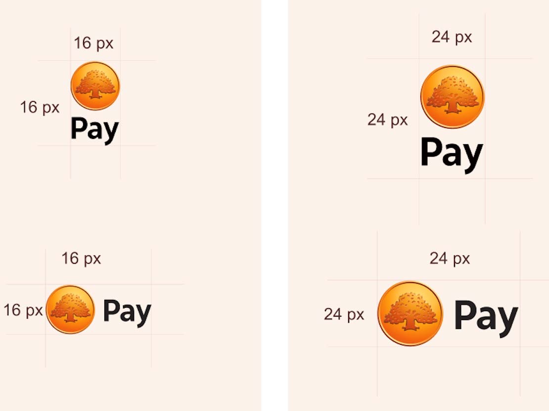
The logotype is available in two sizes. The smaller one is 16 pixels wide and should have a 16 pixel spacing around it. The medium sizes logotype is 24 pixels wide and should have a 24 pixel spacing around it.
The logotype on backgrounds
In situations where either background and color combination can be used, the recommendation is to use the logotype with white text as it gives a lighter and more friendly impression.
On dark coloured backgrounds, use the logotype with white text.
On light coloured backgrounds, use the logotype with black text.
Do's and don'ts
The vertical logo is our primary logo. Try using our vertical logo before using the horizontal logo.
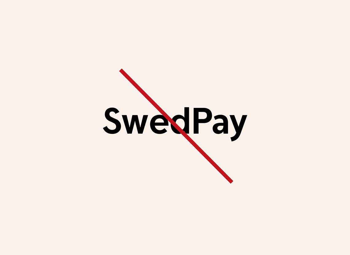
Always write “Swedbank Pay”. In text, always write “Swedbank Pay” when referring to the brand. Never use shortened versions such as “Pay”, “S-Pay” or "Swed-Pay".
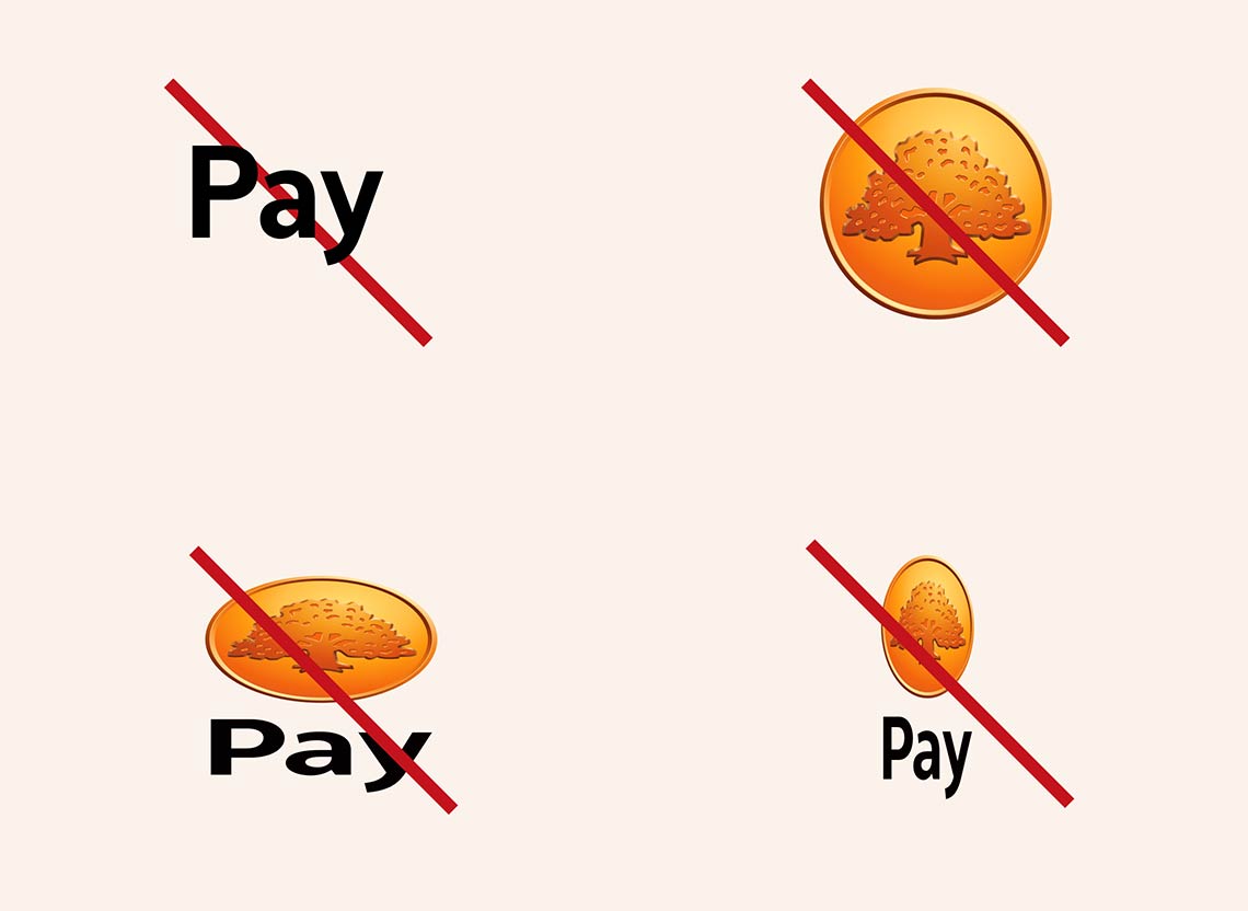
Do not alter the logotype in any way. Do not separate the coin from the wordmark. Never create your own logotype by combining the symbol and typing the text "Pay".
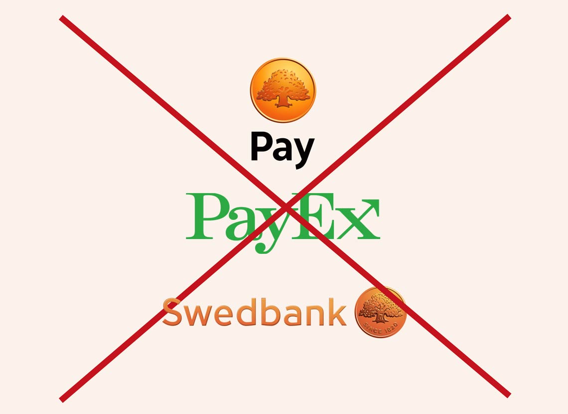
Do not use multiple logos at once. We avoid co-branding to minimize confusion for the users. Do not ever combine Swedbank logo with Swedbank Pay logo and Payex.
Exemple
The vertical logotype can for example be placed to the right of a text about Swedbank Pay.
Download the logotype
Use our logotype when communicating about Swedbank Pay on your website. The logotype in all available formats can be downloaded here.

Any questions?
Do you have questions regarding how to use our brand in your communication, or need help? Feel free to contact our marketing department.
More suggestions for you

Branding guidelines
Are you a client or partner, and want to talk about Swedbank Pay in you channels? We've gathered some quick tips and examples that you can use in your communication.

Do you have a webshop?
Are you using our payment solutions for you webshop and want to present Swedbank Pay to your customers? We've gathered some standarised texts about us that you can copy paste onto you website.

Are you a partner?
Are you a partner and want to present Swedbank Pay to your clients? We have standardised texts about Swedbank Pay and our services that you can copy paste onto your website.